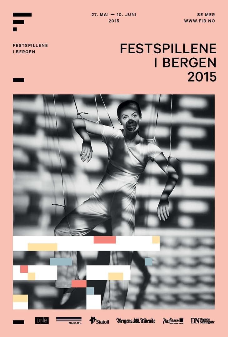
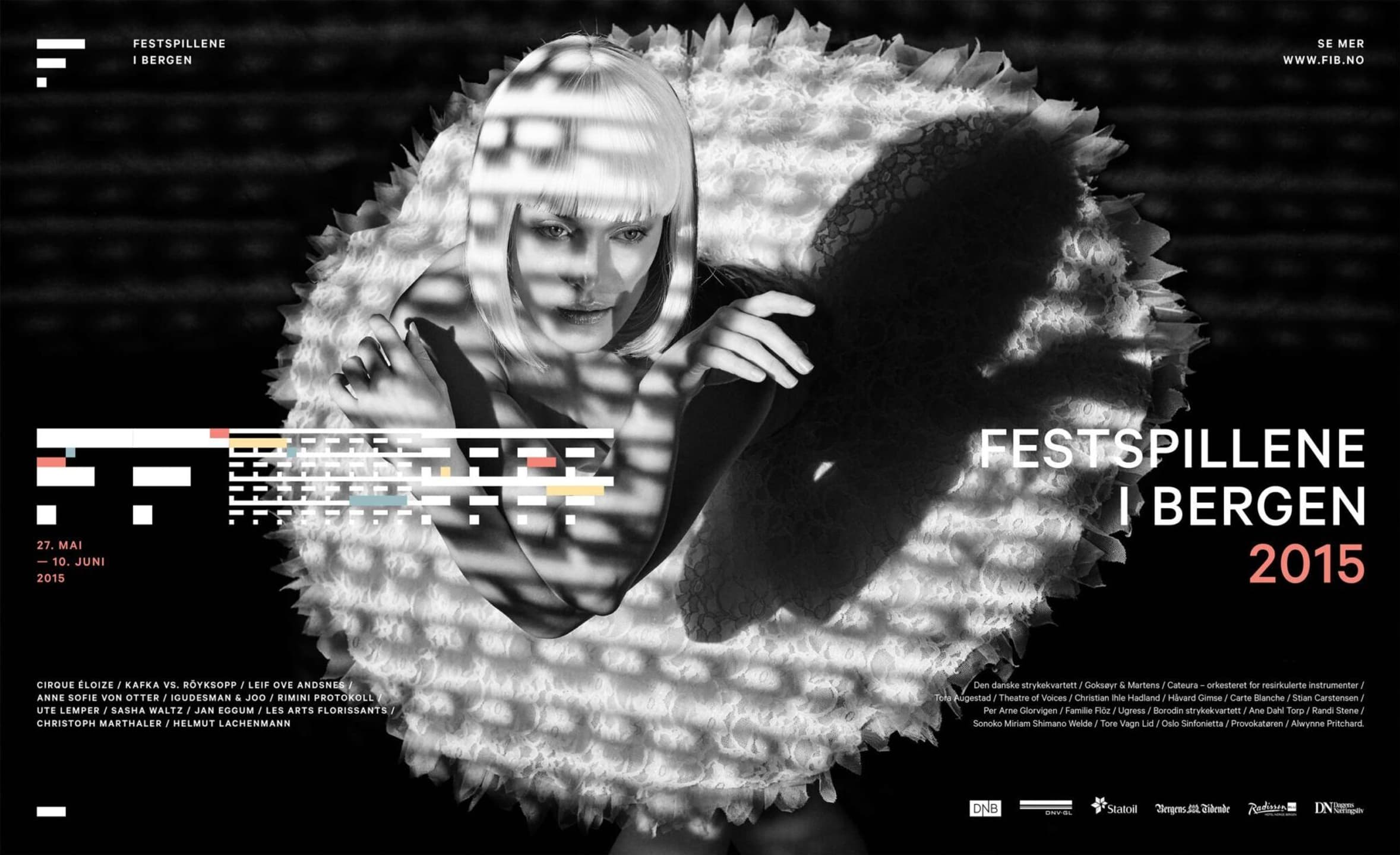
Festspillene i Bergen +
Endless possibilities while never loosing brand recognition
The strategic rebranding of Bergen International Festival demonstrates how the collaboration between client and agency can flip tight constraints into worlds of opportunity. Resulting in the highest internationally awarded brand design of 2014, and one of Norway’s leading design and creative effectiveness cases.
Bergen International Festival (Festspillene i Bergen) presents art in all its guises from music to theatre, dance, opera and visual art. Established in 1953, the festival is one of the oldest and the largest of its kind in the Nordic countries, with more than 220 events during the 15 days it lasts.
With content spanning from accessible street performances through traditional classical symphonies to the avant garde our challenge was to create a visual language that could speak for them all but still speak with one unified voice.
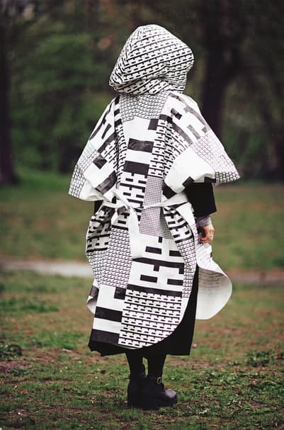
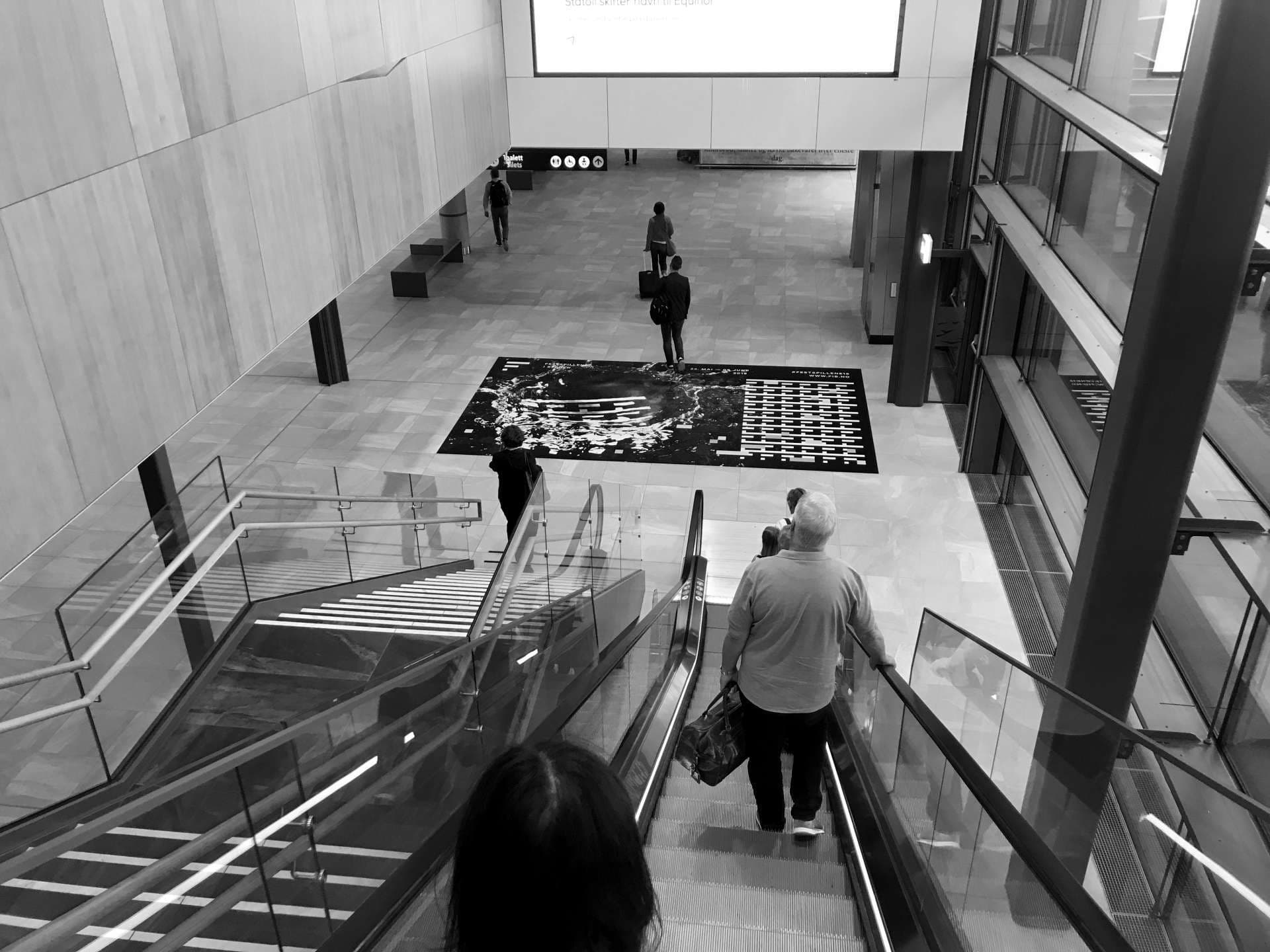
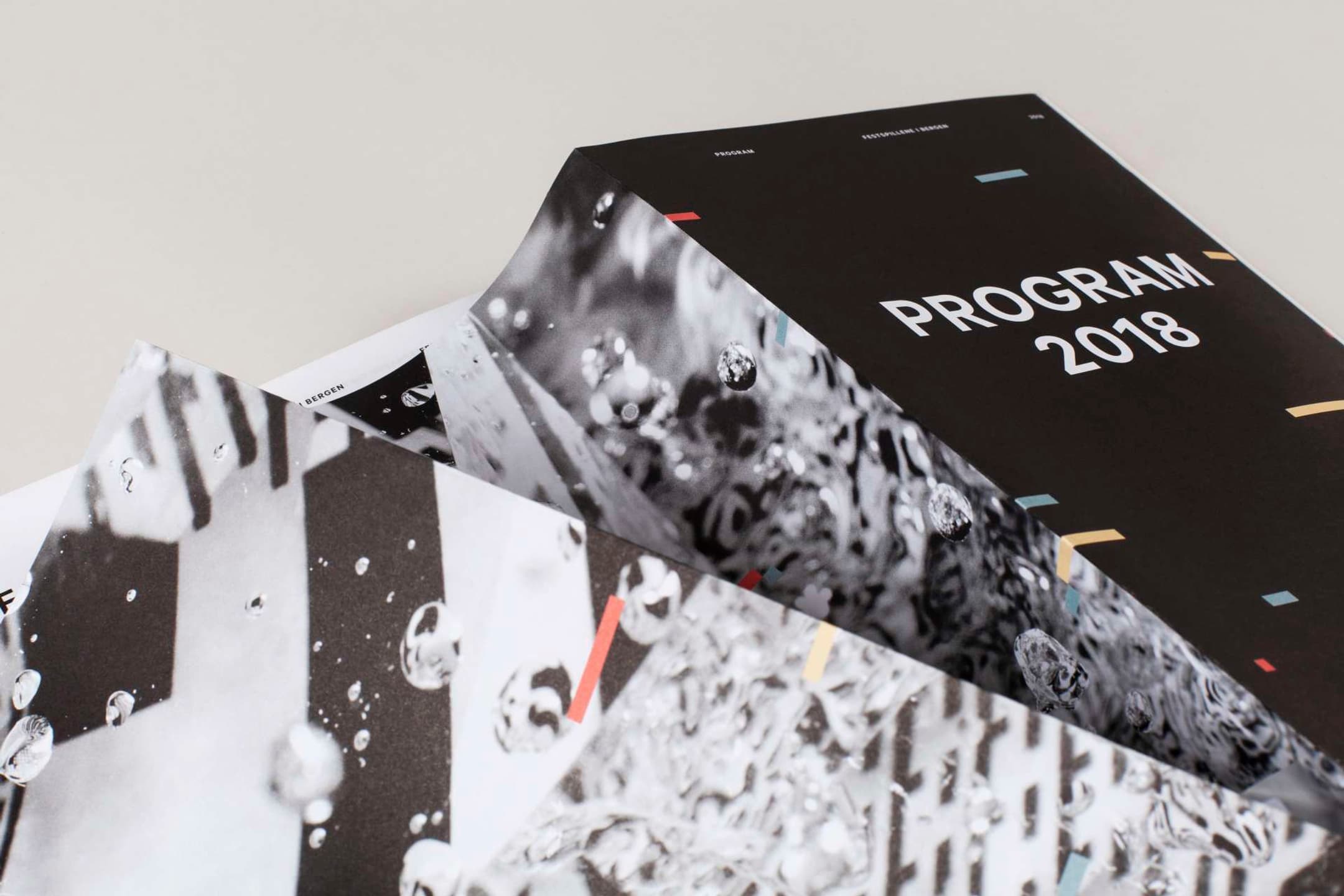
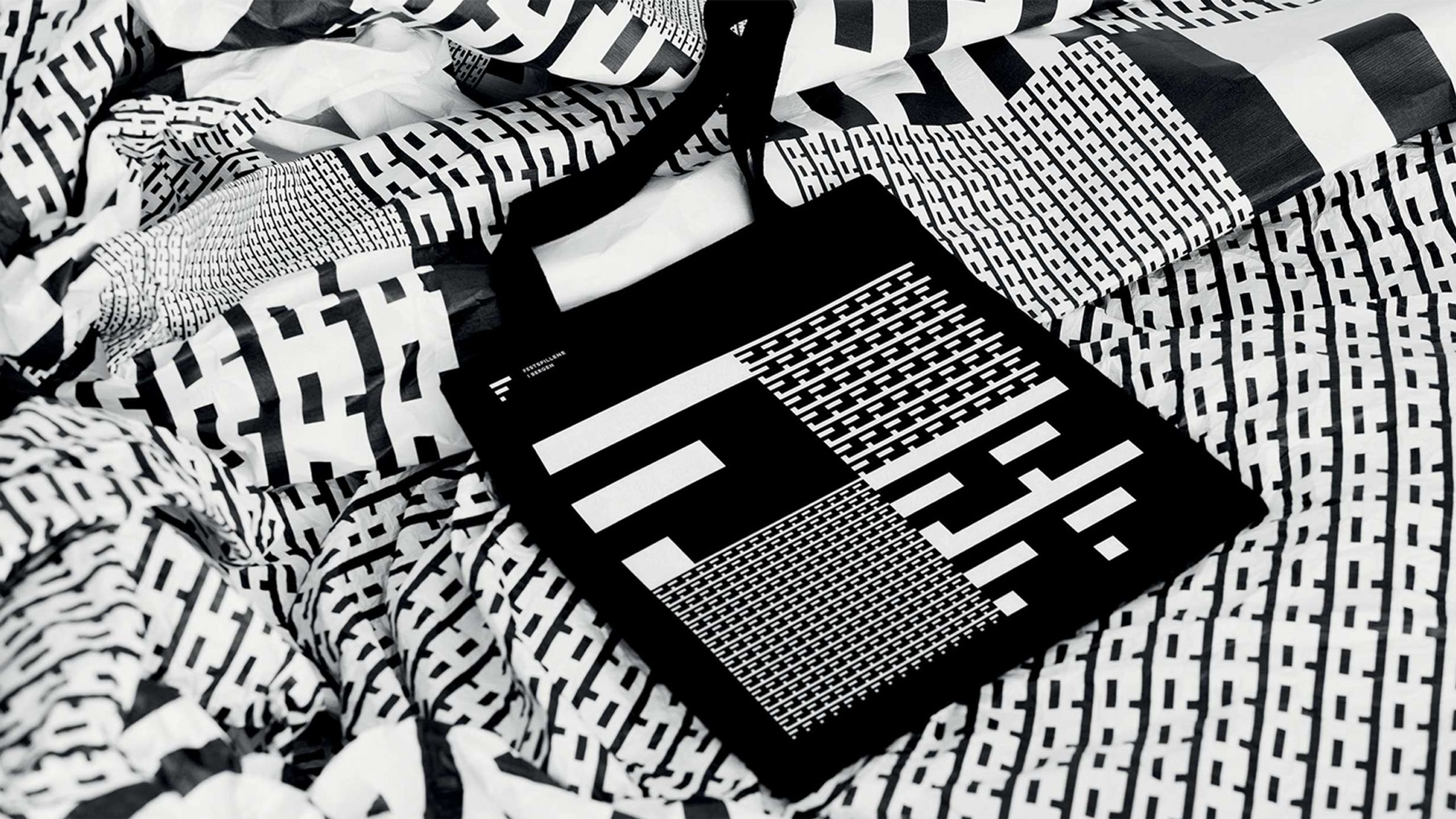
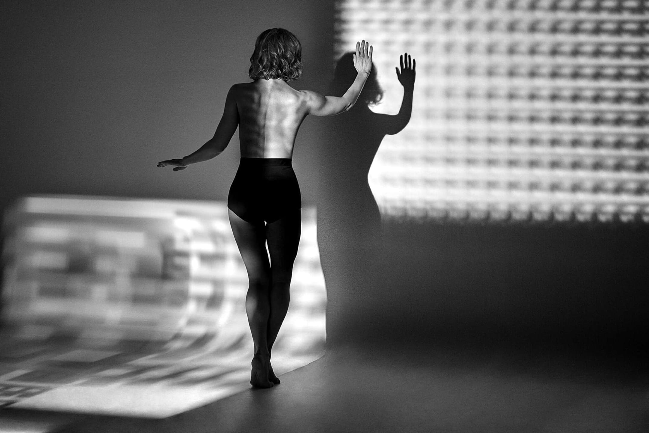
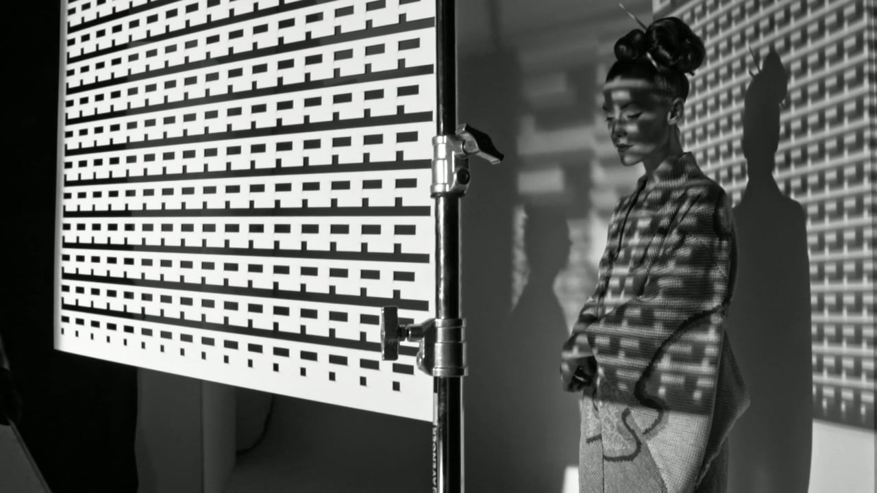
Music is composed of sound and silence, carefully and mathematically structured through a perfect balance of rhythm, pitch, dynamics, and timbre – it is these very elements that Bergen International Festival embodies. The city comes alive during the festival through a harmonious syncopation of different rhythms and melodies, both in the content the festival presents and in the diversity of it's audiences. We've created a unique and strong visual profile that symbolizes the true essence of music and performance. A finely tuned balance between the structural tightness found in music and the playful invitation to grand experiences.
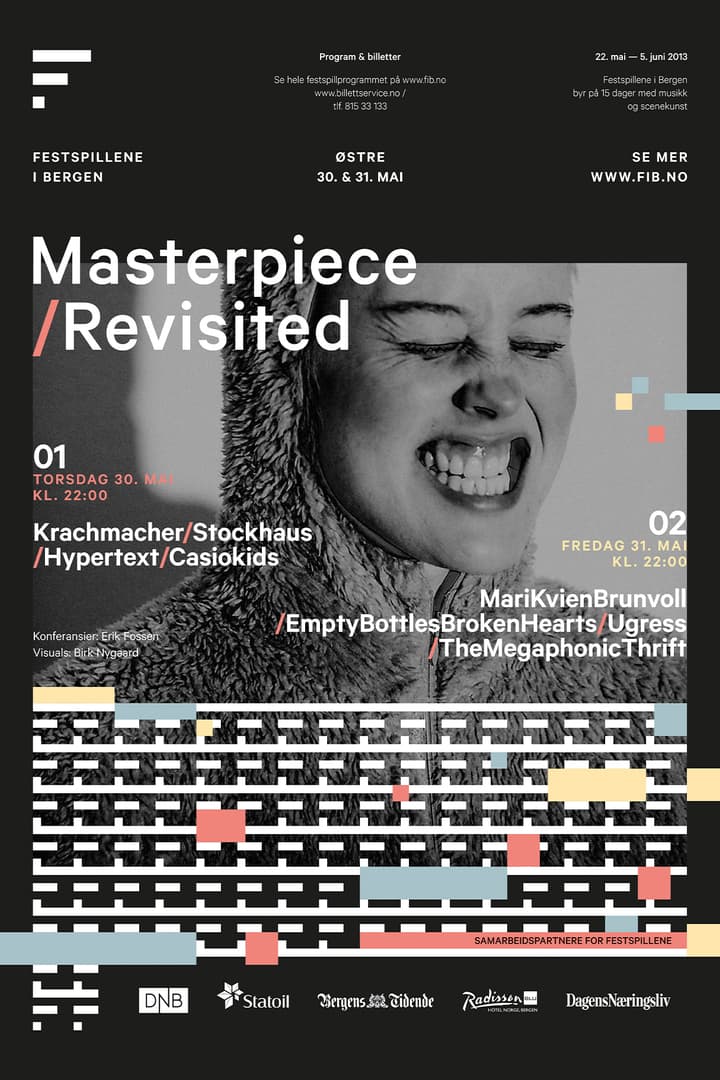
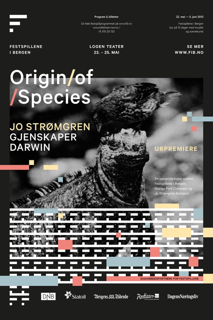


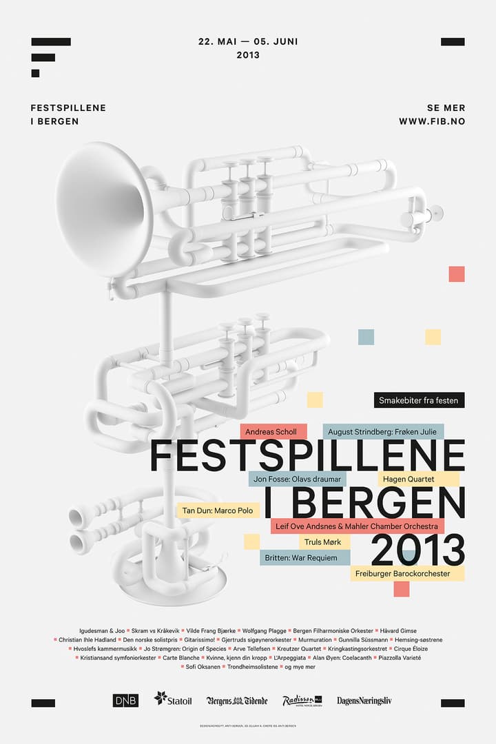
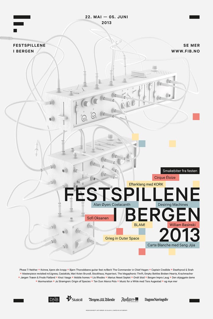
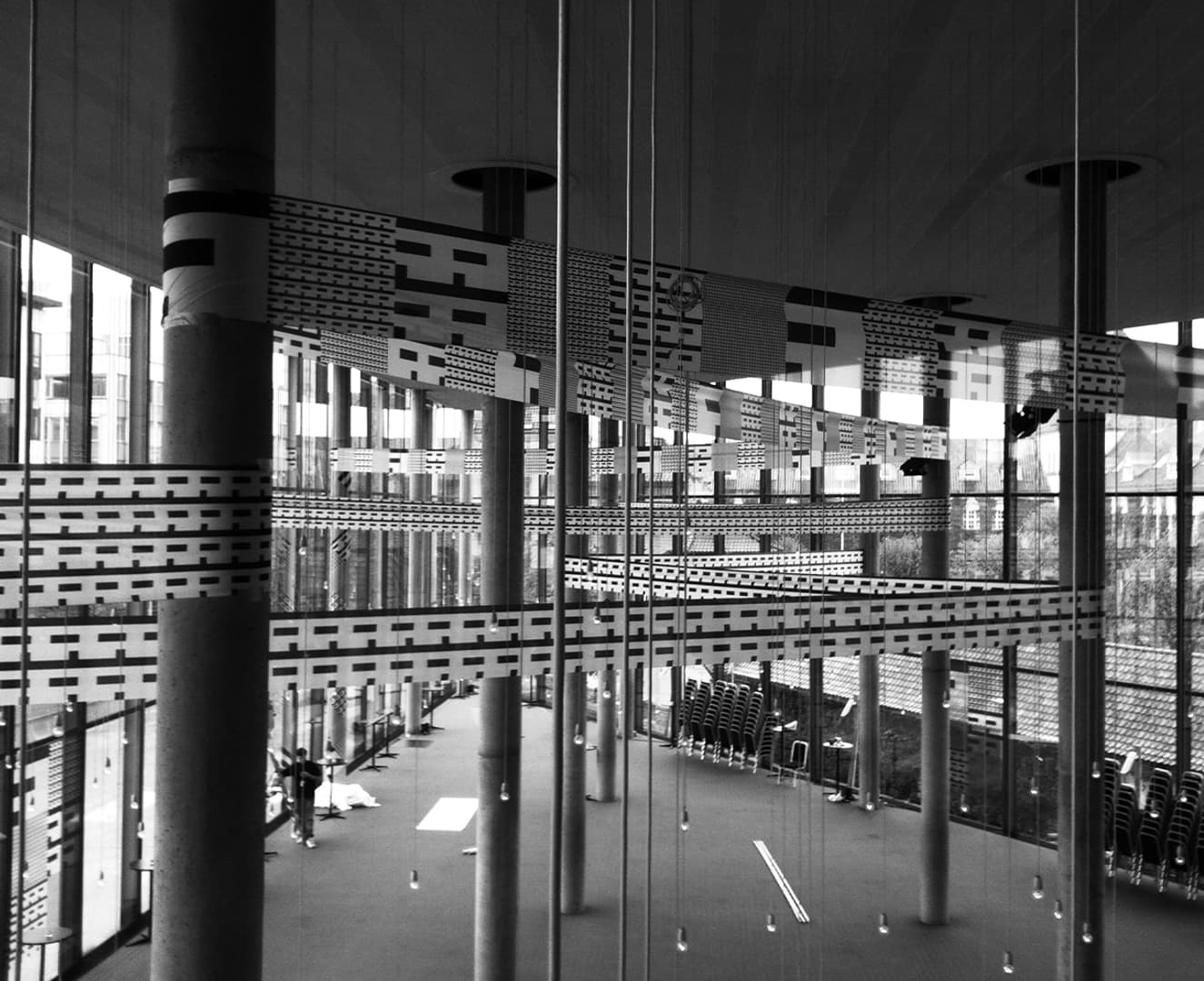
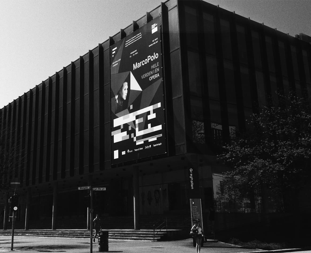
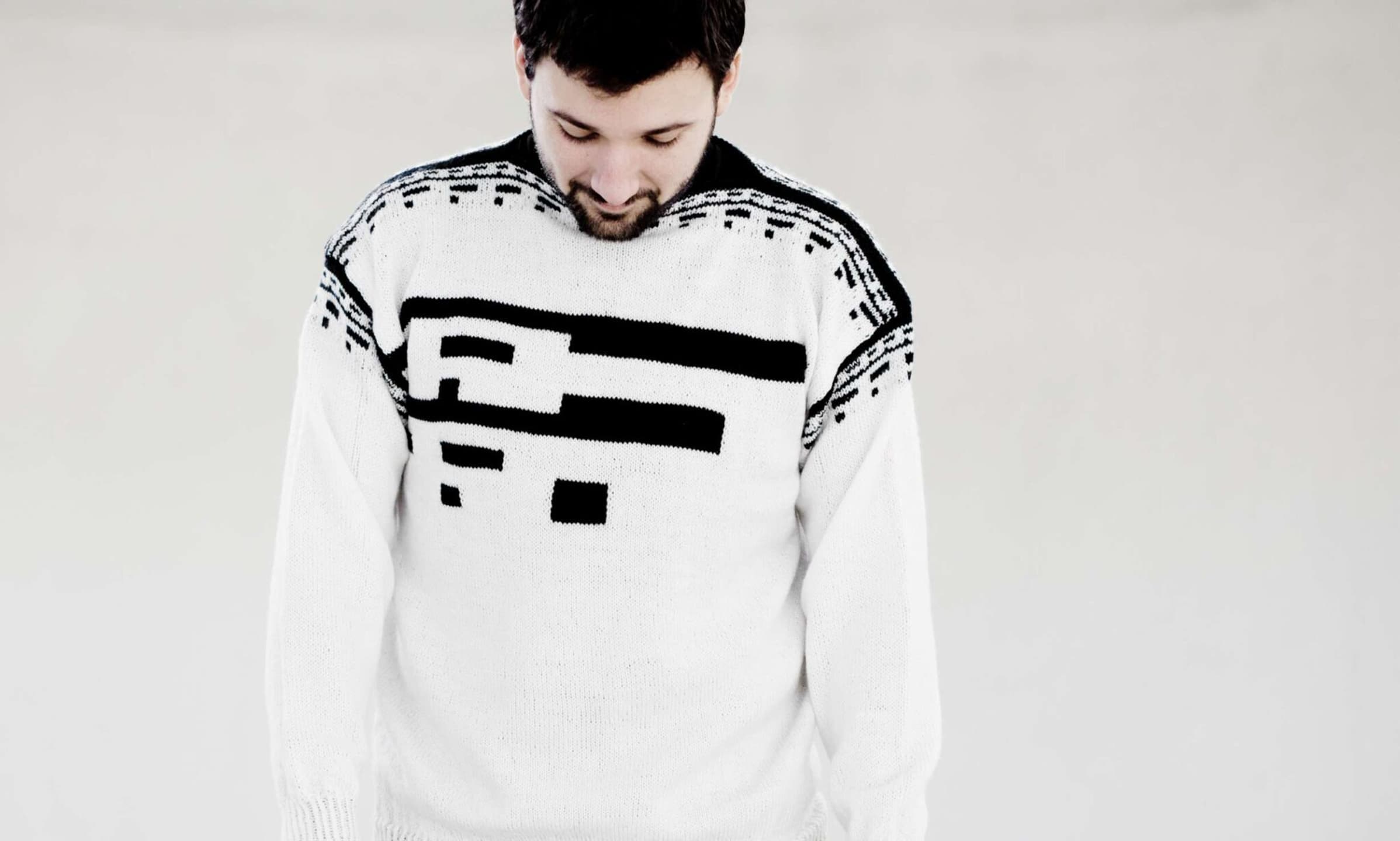
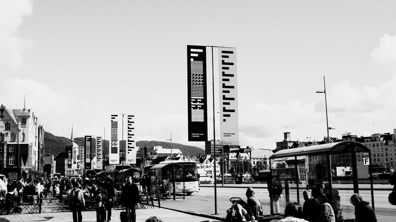
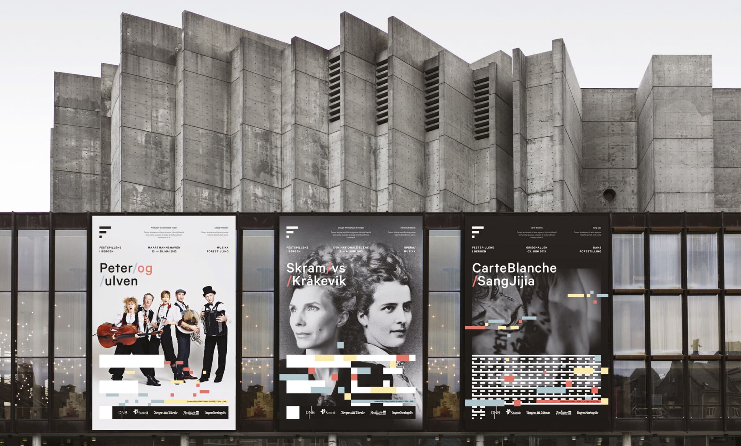
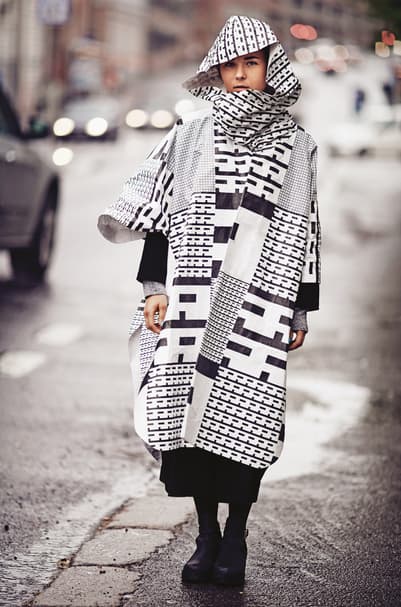
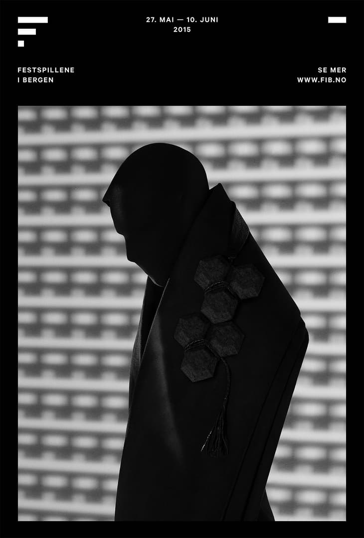
A logo that is both a traditional logo, and a living dynamic identity. A dynamic identity with such frequency that it functions as advertising, product, and performance.
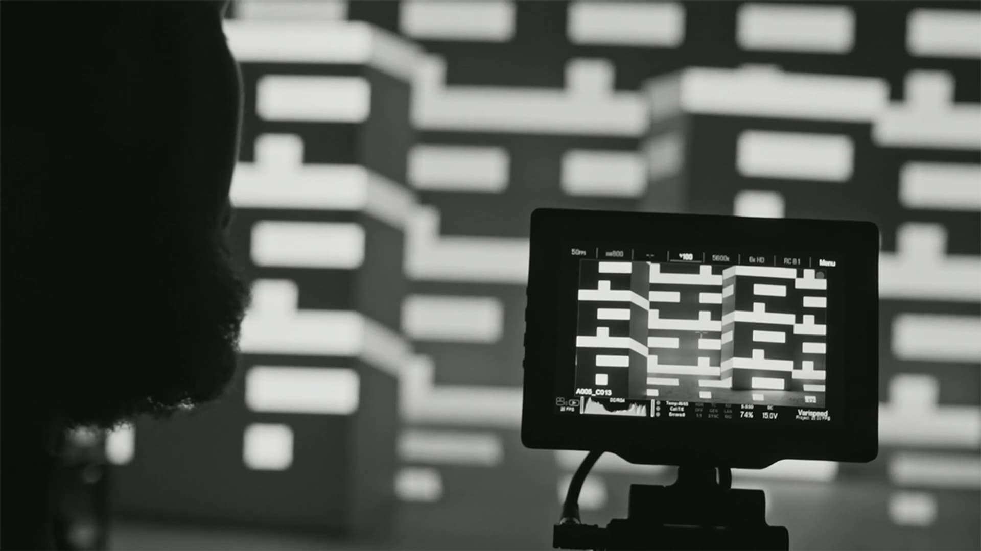
Defining a strict mathematical framework for the logo allowed us to use the perfect square as a starting point for a rhythmic pattern. The pattern – created by applying the rule of four to the logo – provides us with the beat. The coloured bars; the music or human creativity/interpretation. Together they open up for endless possibilities while never loosing brand recognition.
Using creative ambition and strategic vision to overcome limitations of the cultural sector to radically transform the familiar. The project demonstrates how design decisions can lead to increased public engagement, leveraging the temporality of exposure, and find open space in an increasingly crowded cultural landscape.


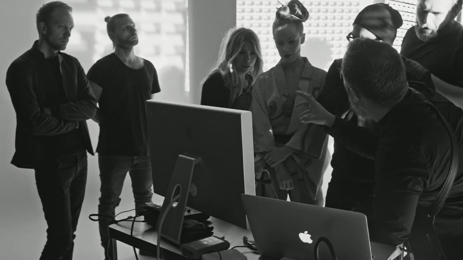
With ANTI being the only communications and marketing service provider involved, the project demonstrates the value of a holistic design approach — a systemic identity with endless functionality.
A brand that has over doubled the size of the festival audience. An audience that is now almost half the population of the city. From a declining festival, perceived irrelevant, to all but a niche audience, now transformed into a truly city and regional-defining event, for all.
Moving from the bald and grey, towards the young and dynamic.
The brand has consistently generated stronger results year on year. Requiring no extra investment per audience member annually. An identity that over four festivals, has shown no sign of fatigue; in fact, quite the opposite
Exceeding all objectives and expectations, and even generated wider benefits, the rebrand has contributed to a 57% rise in ticket sales and 59% rise in sponsorship and private donations, resulting in a 32% rise in total income (2012 - 2016).
The first year of the new festival identity saw a 100% increase of first time visitors and resulted in the highest volume of ticket sales in the recorded history of the festival. Increasing year on year, with public attendants rising from 60 026 in 2012 to 84 494 in 2013; at the same time the total number of visitors to the theatre in Bergen was falling by 8,4%.
From 2012 to 2016 the number of visitors grew to over 125 000 — an increase of 108%. Resulting in a 27% efficient use of public funds in the first year alone — evidence of the public value of design investment.
In 2014, for the strategic rebranding of Bergen International Festival, ANTI was awarded the Cannes Lions Grand Prix in Design, the Grand Prix in Brand Identity at Red Dot, 2 Golds in ADC Global, Gold Pencil in One Show and Best of Show at the European Design Awards, Merket for God Design, Gold at Gullblyanten, 2 Golds at Visuelt, and in 2017 STELLA award and Hegnar Media Businessprisen for Creative Effectiveness. In 2018 ANTI became the first Norwegian agency to be awarded the prestigious Design Business Association’s Design Effectiveness Award.