Duenger Gruppen +
Duenger – Fremst på kvalitet
Identity and Communication Strategy for Norway's Leading Professional Trailer Supplier

After significant growth and structural changes, the Duenger family is establishing a corporate structure and launching a new identity. Duenger wanted to consolidate their brands under the Duenger name, to make the brand stronger and more visible.

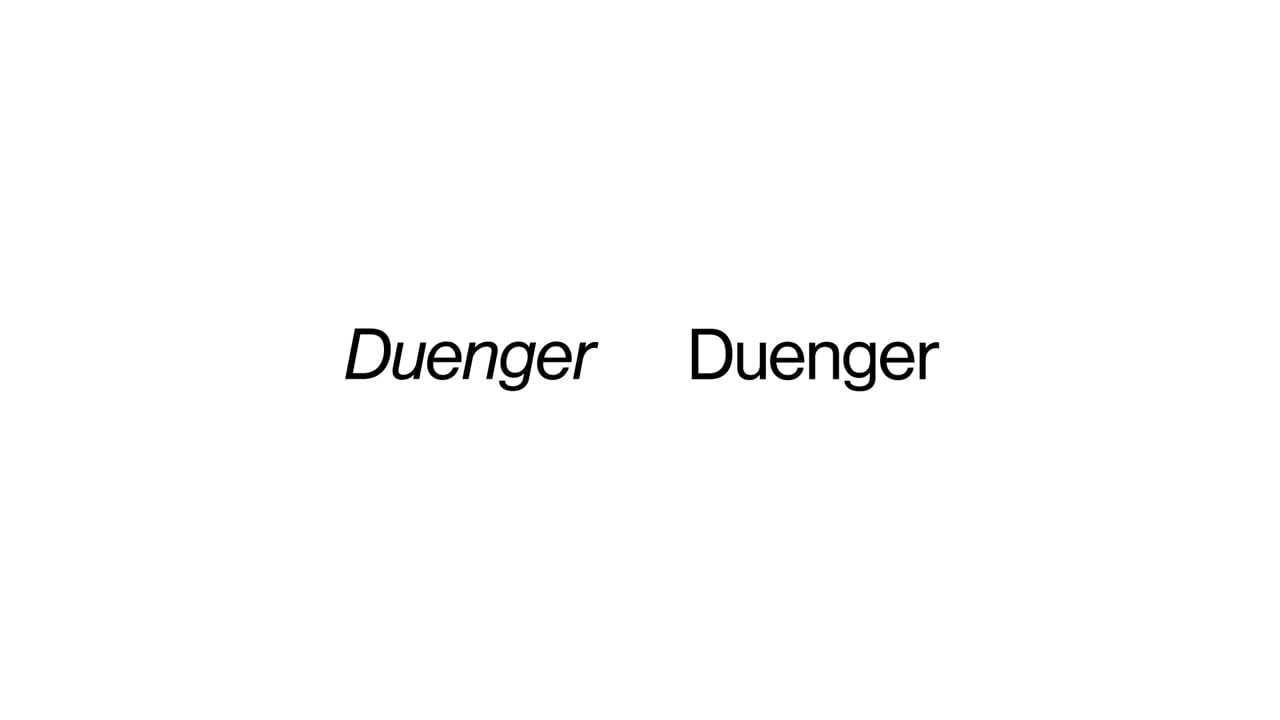
The identity is built on the company's two core values: “quality” and being forward-thinking in everything they do. This is visually described in a design system where the logo, layout, and use of fonts employ a simple yet effective approach. The slogan “Fremst på kvalitet” (“leading in quality”) is reflected in the identity, for example, the logo is composed of two basic elements, the solid base and the forward-leaning top. This simple approach is consistent across all materials. Two typographic units, regular and italic, have been used as the foundation for the concept.


Related projects


Marienlyst
Ferd +


