Selmer +
The (r)evolution of a law firm’s identity
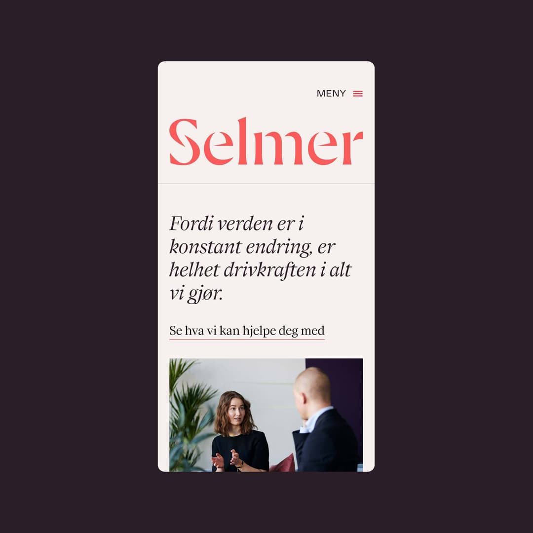
Established in the mid 1980s, Selmer is one of Norway’s leading business law firms. They invited us to evaluate their brand platform and redesign their identity and web presence so that it would align more closely with the company’s ethos.
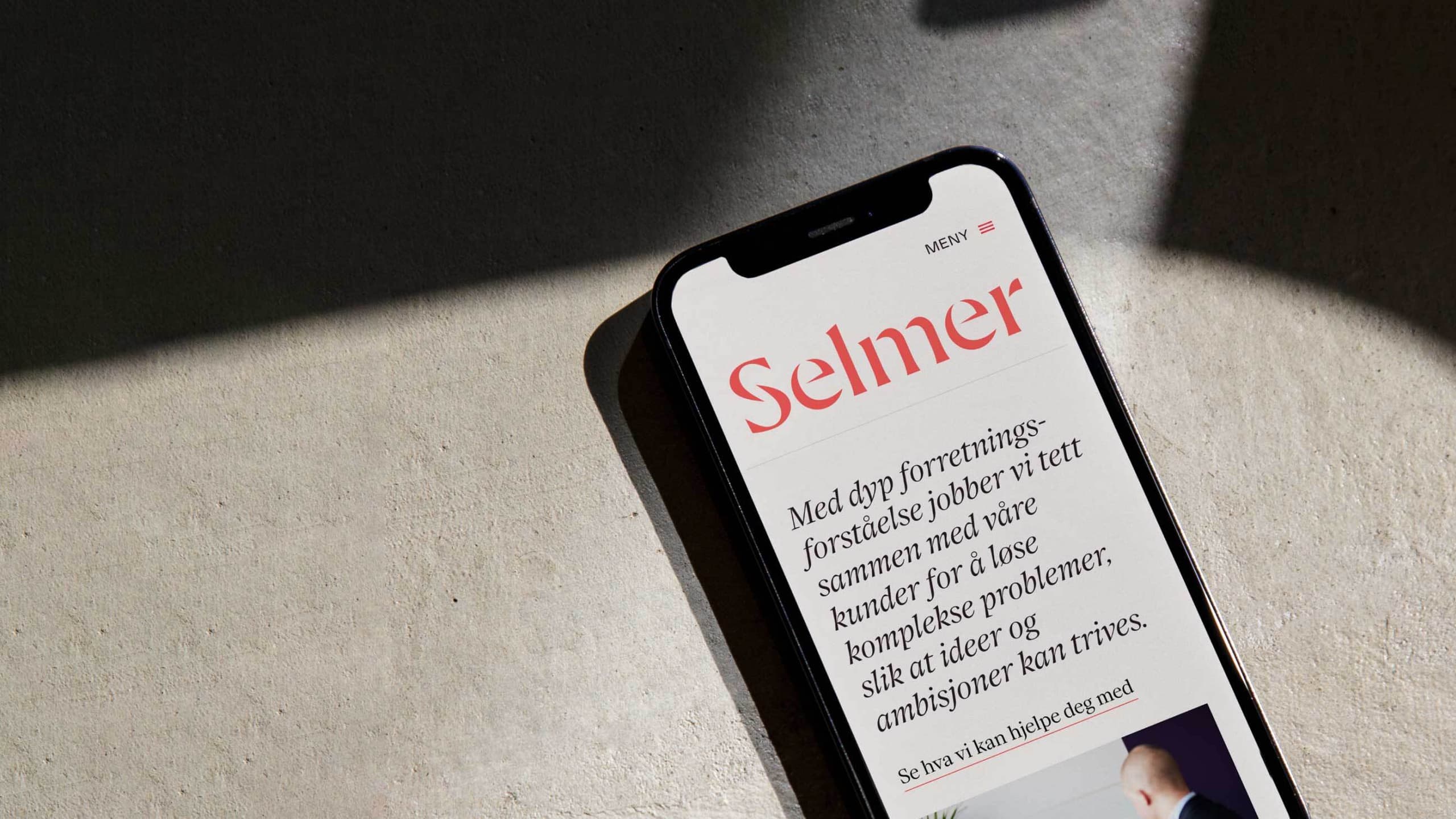
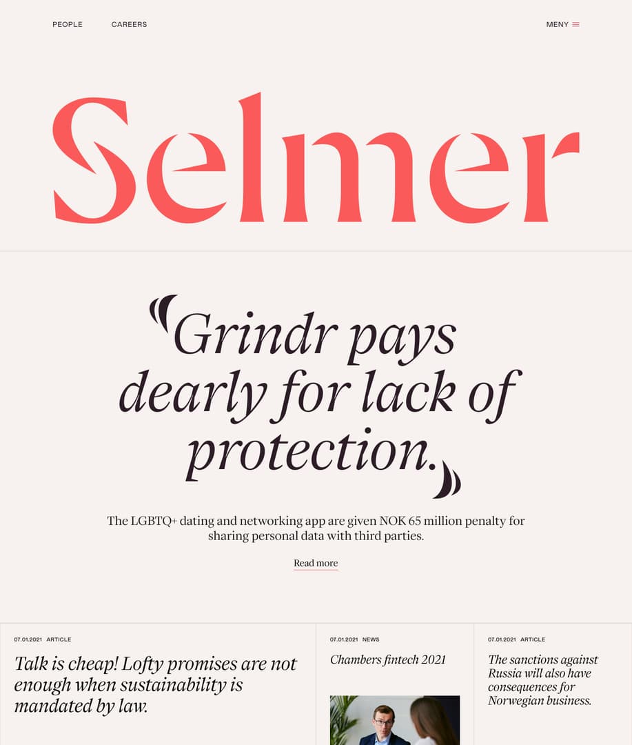
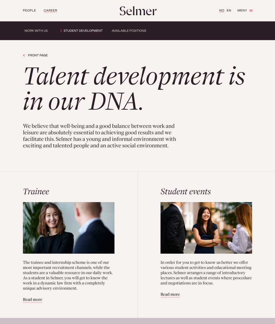
Selmer is known for their expertise and commitment to providing exceptional legal services for their clients. Their lawyers also write informative articles with topics ranging from changing EU competition regulations, to developing regulatory frameworks for offshore wind and carbon storage – so it felt natural to establish a strong visual presence with an editorial feel that would reflect this approach.

The original S-icon from the old logo formed the base of the new Selmer logotype. We wanted to capture some of the energy from the old icon whilst designing a new, modern and sophisticated logotype for the law firm.


Beyond the need for updated core brand elements, we wanted to give Selmer’s identity and communication a built-in dynamism and expressiveness. As part of the editorial approach we designed custom quote marks which were programmed into their new identity font ES Face Selmer. The marks can be animated out from the S-icon to create a direct link between the identity and the forthright nature of the firm’s statements.
The illustrations includes a custom designed section sign that is based on the S-icon. Through the section sign the illustrations can be animated in or out from the S-icon and the quote marks.


The new identity and website embody Selmer’s professionalism, integrity, and dedication to excellence – while at the same time giving a little more attitude to their communication.
Collaborators
Related projects
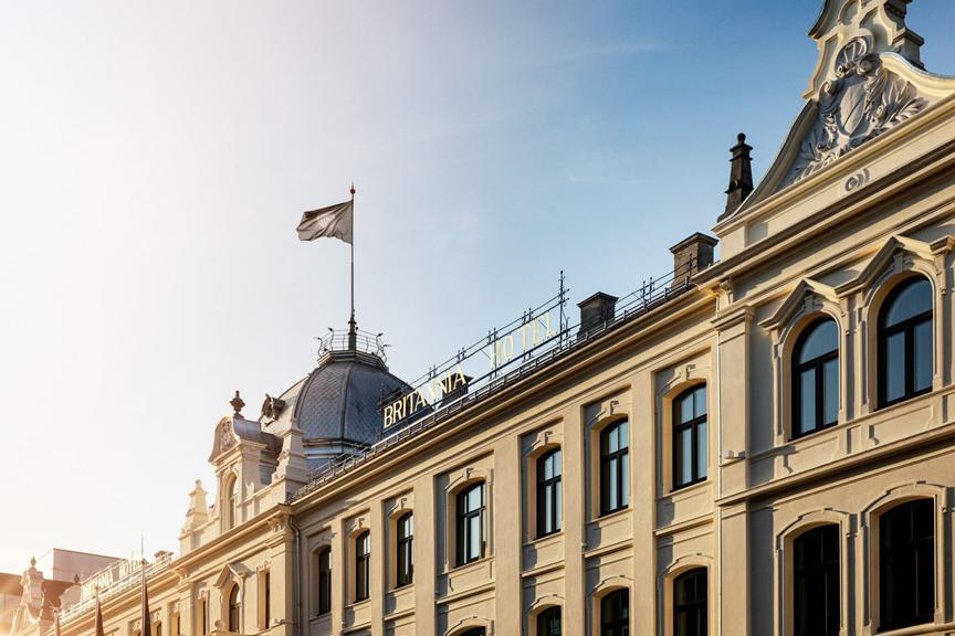
A house of influence since 1870
Britannia +
Kunstnernes Hus
Kunstnernes Hus +


