Optiker-K
Identity and custom typeface

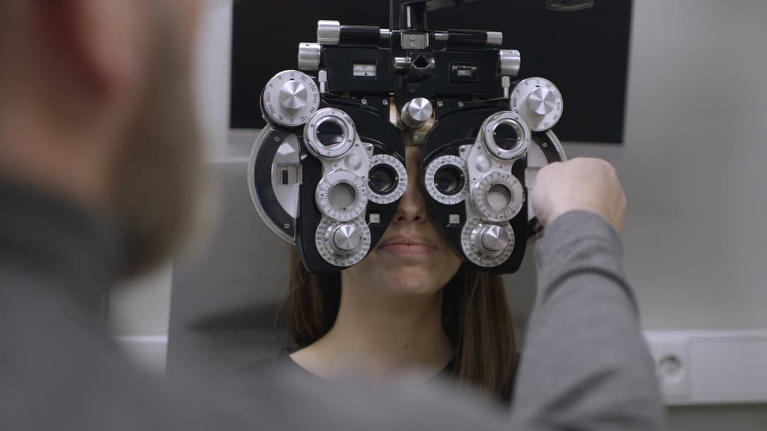
Optiker-K is a renowned optometry business, the “K” signifying the Krogh family, a lineage of optometrists with a legacy dating back to 1877 when they established their first practice.
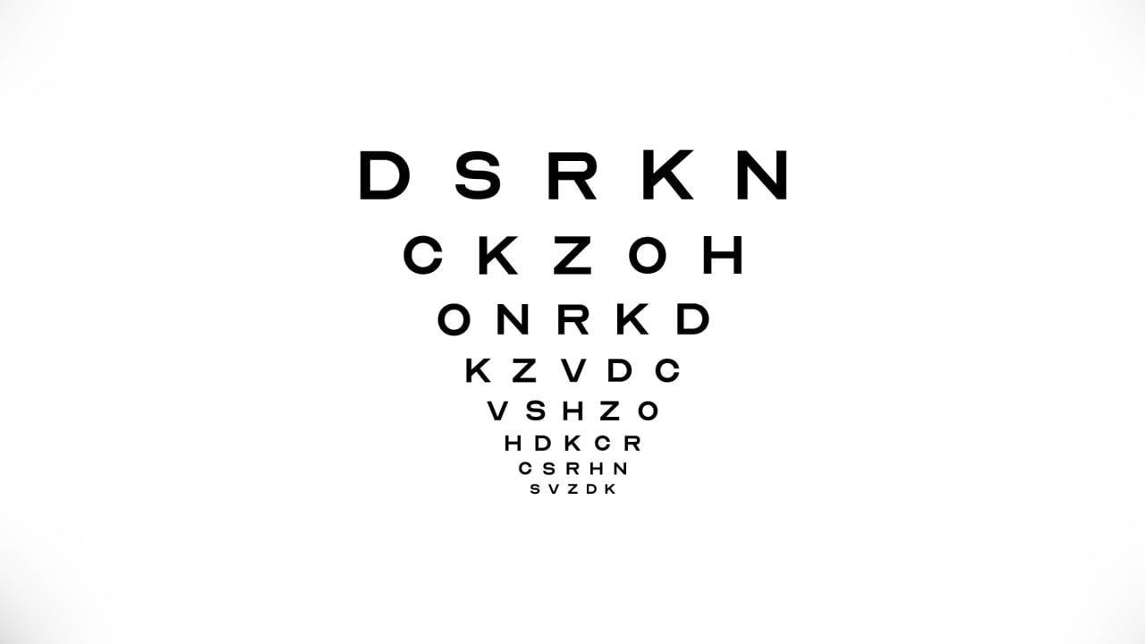
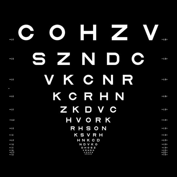
In developing this new identity, the aim was to encapsulate over a century of experience and proficiency. Exploring the historical eye charts, a hallmark for all opticians, we sought to pay homage to a tool that has been recognized globally for more than a hundred years. The first standardized eye chart, conceived by Herman Snellen in 1862 and further refined by Louise Sloan in 1959, eventually gave rise to the LogMAR-chart, which is now the prevailing standard.
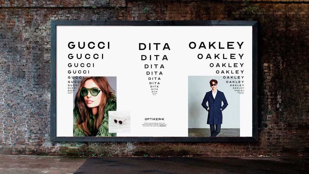
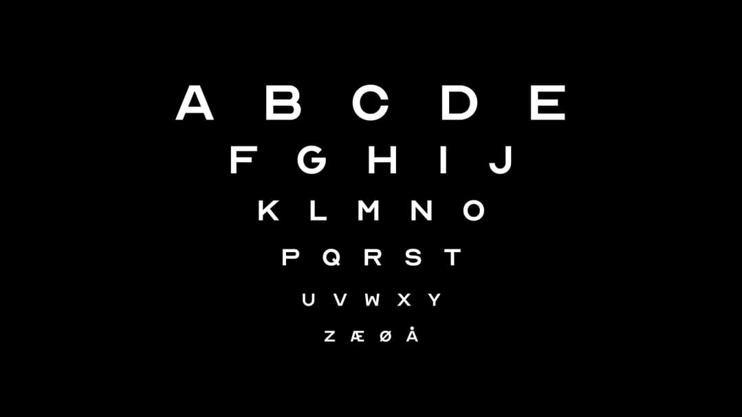
Surprisingly, the distinct optician eye chart, comprising only 10 letters, had never been fully realised as a typeface. Thus, the decision to craft a complete typeface, encompassing numbers and special characters, was made to connect the Optician-K brand directly to the optometrist's craft. This comprehensive approach to the typeface, incorporating the logo and pictogram, not only streamlined branding but also honoured the authentic principles of the original optotype letters. Ultimately, this visual identity effectively conveyed Optician-K's decades-long experience and expertise in an uncomplicated and easily accessible manner.
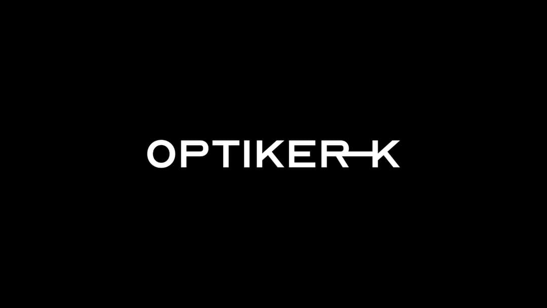
The custom typeface played a pivotal role in defining the brand's visual identity. By incorporating the logo and pictogram into the typeface itself, the need for separate logo files was eliminated. The brand typeface, optimized while preserving the essence of the original optotype letters, effectively communicate Optician-K's extensive experience and expertise through a simple and easily understandable visual identity.