Bane NOR +
Designing screens that moves millions of people
We partnered with Bane NOR to enhance the design of their nationwide digital information system
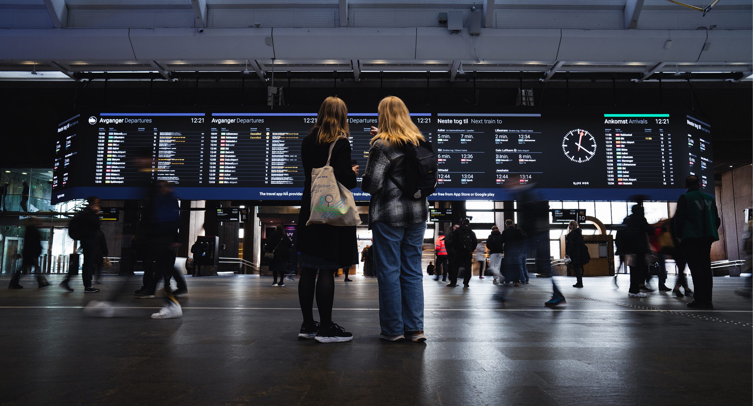
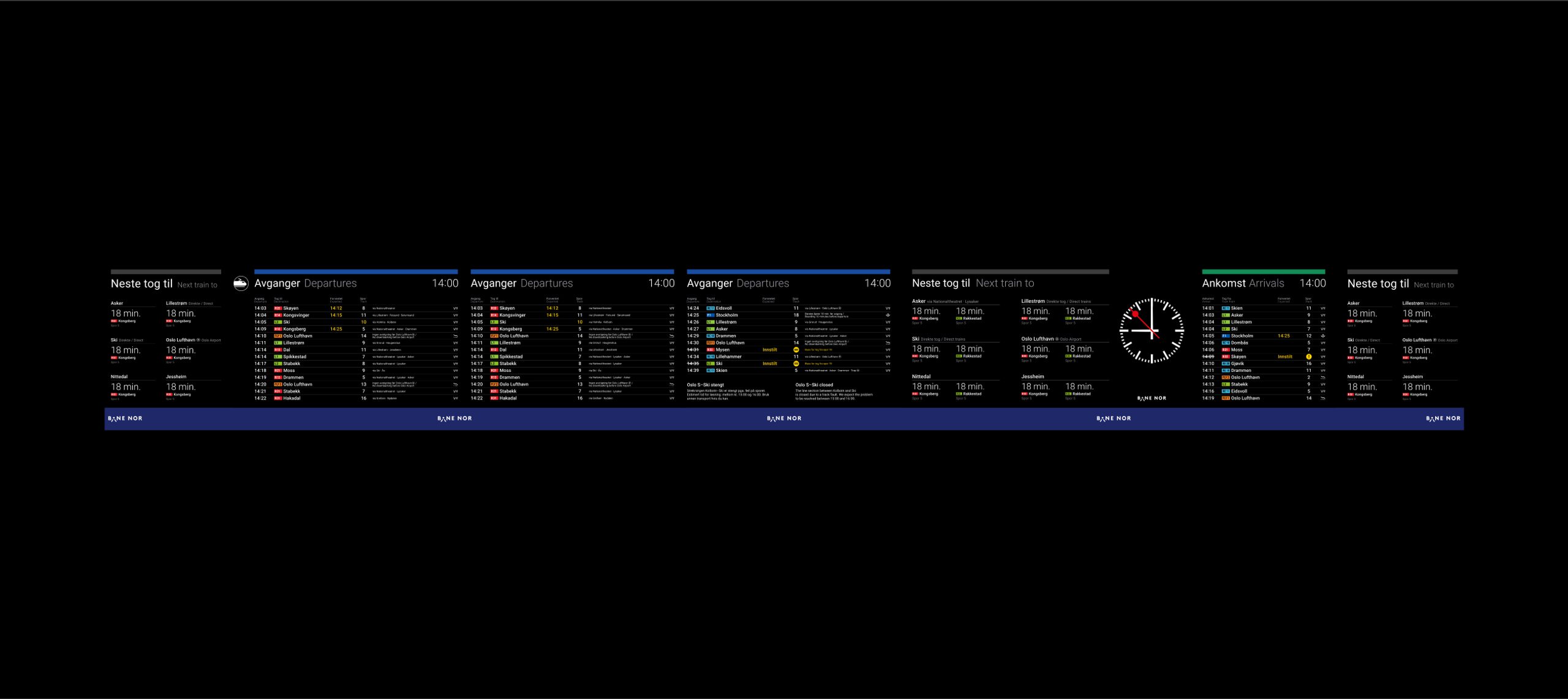
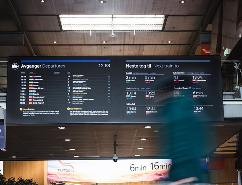
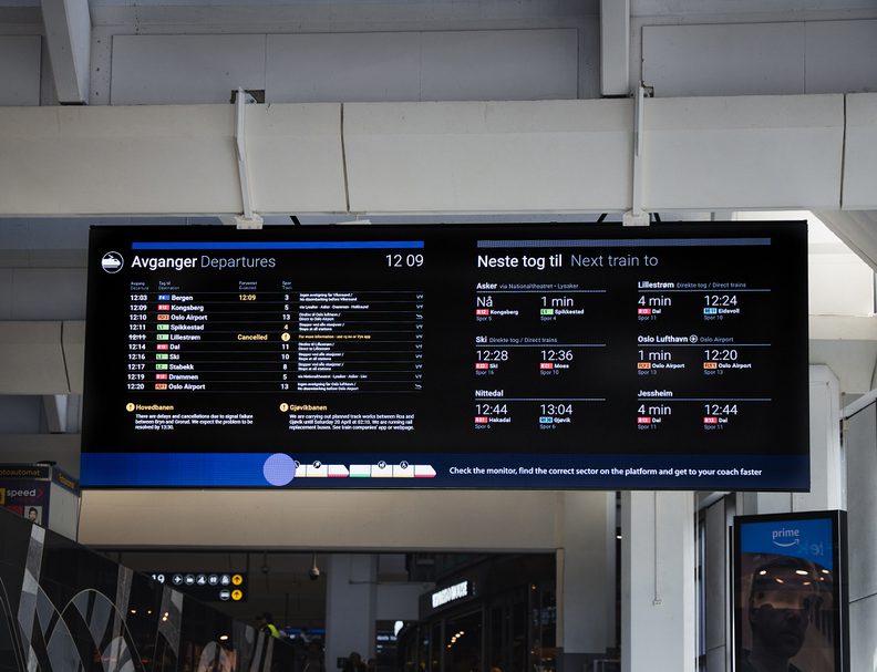
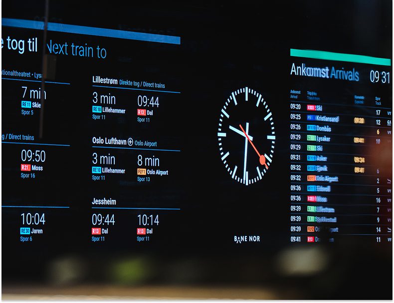
We designed the content layout for the 31.5-meter main display at Oslo S, while in parallel enhancing the nationwide digital information system that serves more than 330 stations across Norway.
Behind the scenes, a CMS puts Bane NOR in full control of what appears on the screens and when. At the bottom, we introduced a dynamic ticker, an ever-present line of motion that not only carries station updates but also gives space for Bane NOR’s voice. Through subtle animation, the ticker transforms into a stage for seasonal moments and celebrations, from Pride to May 17th, turning everyday travel into a more human and memorable experience.
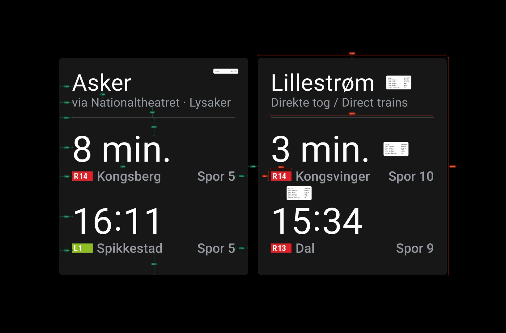
Over time, the display ecosystem expanded from a few fixed formats to a broad set of screens with varying dimensions and requirements. The complexity of the content also increased, with new data types, layouts, and compositions introduced.
To handle this, we built a digital component library that consolidated all screen types and their respective views into a single, scalable system. This ensured consistency across stations while making it easier to adapt designs to different formats.
Every element in the library was thoroughly specified and documented. To maintain accuracy and efficiency, we developed a custom Figma plugin that automated the documentation process and safeguarded the integrity of the design specifications.
Throughout the project, we focused on improving the overall passenger experience. ANTI delivered improvements across the entire information ecosystem, working closely with train operators such as Vy, Flytoget, and SJ to identify pain points. Some issues were minor and easily solved—for example, correcting elements that displayed in the wrong color. Others required deeper investigation, involving research, user testing, and more complex implementation to ensure lasting improvements.
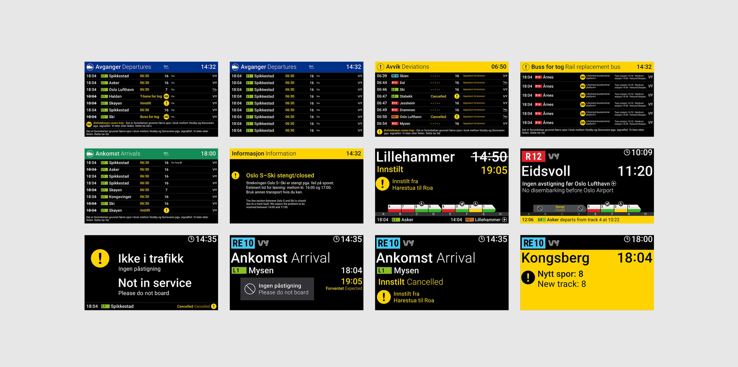
Example of improvements we delivered included:
Stop Pattern
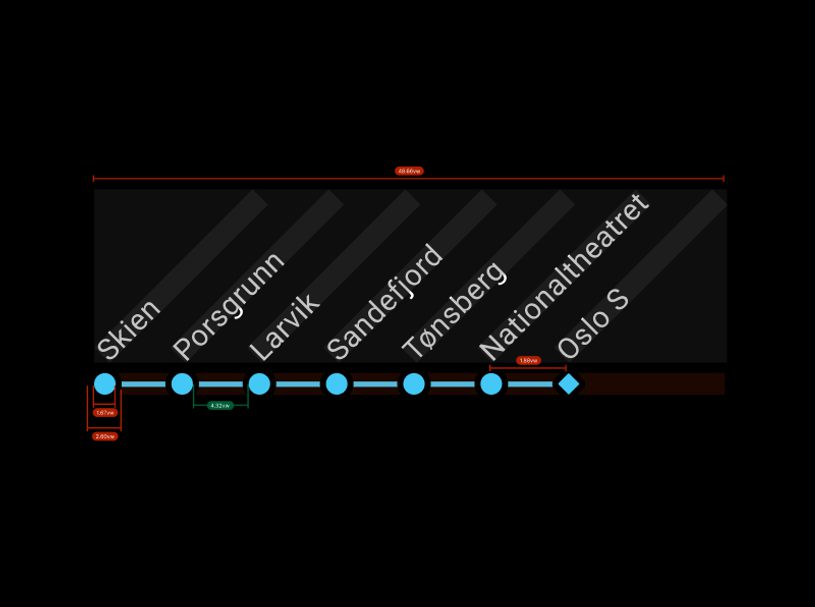
Introduced a new visual system that clearly shows where trains stop and where they do not—solving the problem of overly long text descriptions at certain stations.Deviation Layout
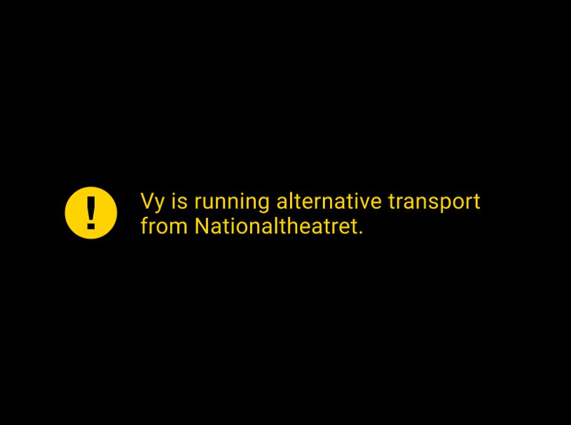
Designed a dedicated layout that activates during disruptions, making it easier for passengers to understand when multiple trains are delayed or cancelledDetailed Information
Implemented a system that provides clearer details when a train is delayed or cancelled, going beyond the simple “cancelled” message to explain what passengers need to know.Track Change
Established new rules for how track changes and next departures are displayed on track indicators, reducing confusion and improving wayfinding.Train display
Introduced multiple enhancements, including clearer occupancy indicators, car numbers, platform selectors, and other refinements to improve passenger orientation.