DNB +
From A to Z
DNB is Norway's largest financial services group, offering a full range of financial services, including loans, savings, advisory services, insurance and pension products in addition to real estate to both private and business sector. With 2.1 million private customers in Norway and the country's largest mobile bank (1.7 million users), they are part of the everyday lives of millions of people.
Since DNB took their new name in 2011, ANTI has been DNB’s design partner. As a brand agency for DNB we focus on insight in all of our projects and with strategic design we constantly evolve their identity to keep the brand relevant and vibrant. DNB is a strong and monolithic brand and needs a broad and flexible visual toolbox to be perceived as credible by people of all ages, with different backgrounds, knowledge and financial situation. With a clear and recognizable identity, DNB manages to stay focused and at the same time differentiated towards all its target groups.
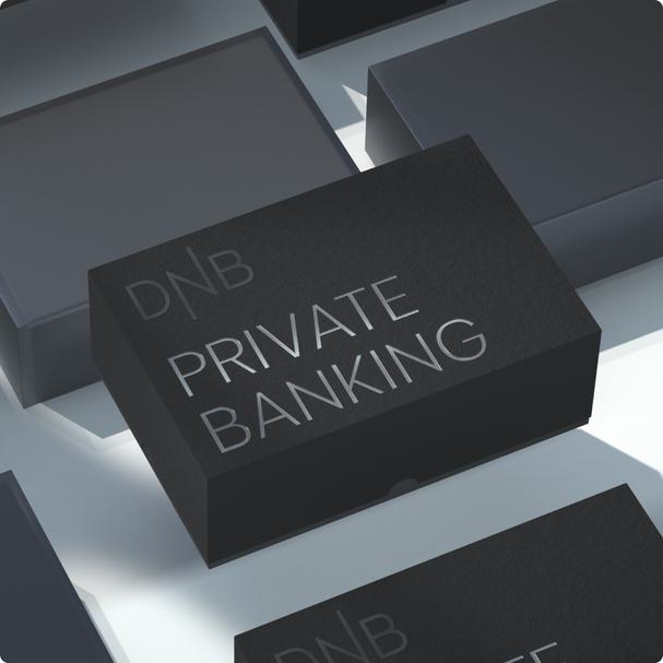
DNB is well known for its color palette – “Shades of green” – and as many as 95 % of the population associate the sea green color to DNB. It is therefore vital to work with and revitalize this brand asset in new and unexpected ways. DNB does not just offer banking services, but is a company with knowledgeable and empathetic advisers who are there for you through the various stages of life. In an easily recognizable sea green scene, the new brand images mirror a diverse and colorful customer base and convey that all economies are equally important.
The everyday life is digital and DNB continuously updates the visual toolbox for ease of use, readability and technical functionality. Typography in the form of a recognizable typeface is a visible brand asset and an important tool for a wide range of surfaces. Together with Markus Rakeng, we designed DNB Sans – a modern but timeless typeface. Informative but also friendly. Universal design is key and along the way, we worked closely with DNB's UX designers and Blindeforbundet.
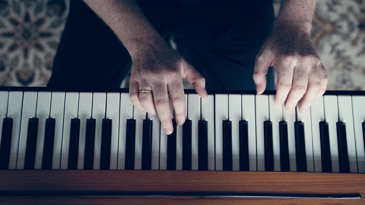
Sound affects us by evoking feelings and memories, and has an even stronger recognition effect than visual expressions. As brands produce more content than ever before, sonic identities are becoming increasingly important in the battle for attention and recognition.
In close collaboration with DNB and Ohlogy, we created DNB's sonic brand universe. The sonic logo is based on the natural rhythm of DNB's slogan From A to Z – four notes in rhythm with the heartbeat that shape DNB's sound. The same four tones became a large and flexible sonic identity that clarifies and reinforces the brand in communication, events and podcasts.
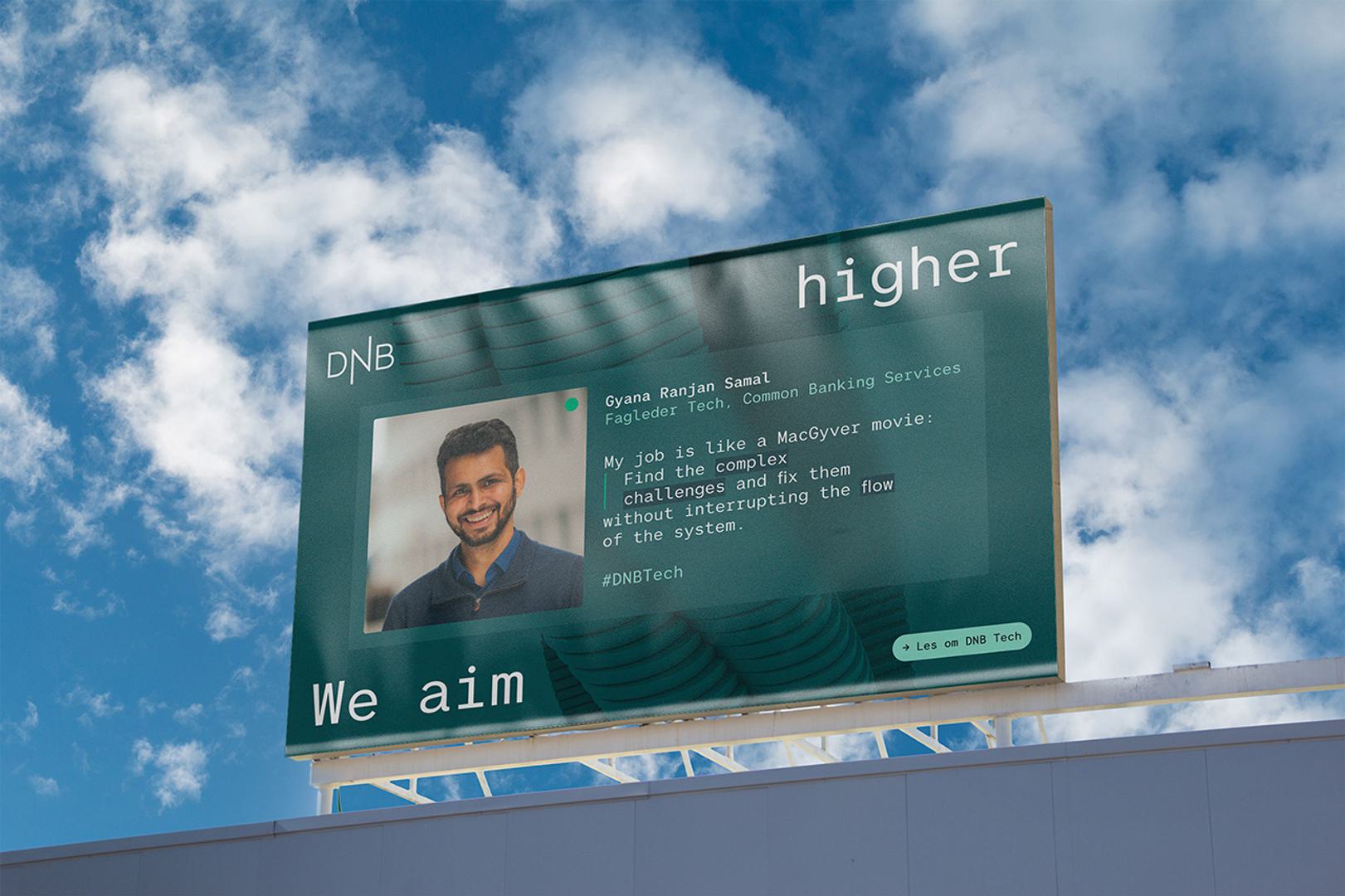
DNB is one of Norway’s most attractive employers, and it is vital to find and keep the best tech talents. Based on DNBs concept – We aim higher – we designed a rich and tech savvy 3D universe with references to developing and gaming. The employer branding identity is widely spread and contributes to maintaining DNB as an attractive and ambitious employer.
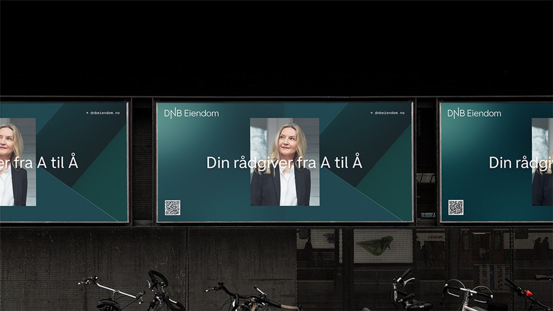
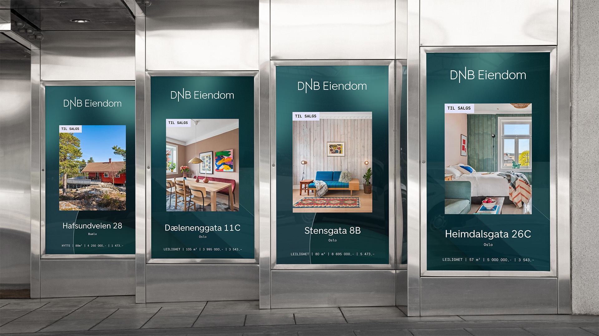
Like DNB's identity, we work dynamically and continuously with DNB Eiendom's visual identity. However, they are in a different market and have other needs than the mother brand. This leads to the need for own visual tools and brand assets within the framework of DNB's overall expression. The revitalized identity corresponds to DNB Eiendom as a solid and empathetic advisor who understands the everyday challenges most people face when selling or buying a home, in a visual expression that is inviting, empathetic and more premium.