Bikeshop
Visual identity for Norway's largest specialist shop for cyclists, Bikeshop.

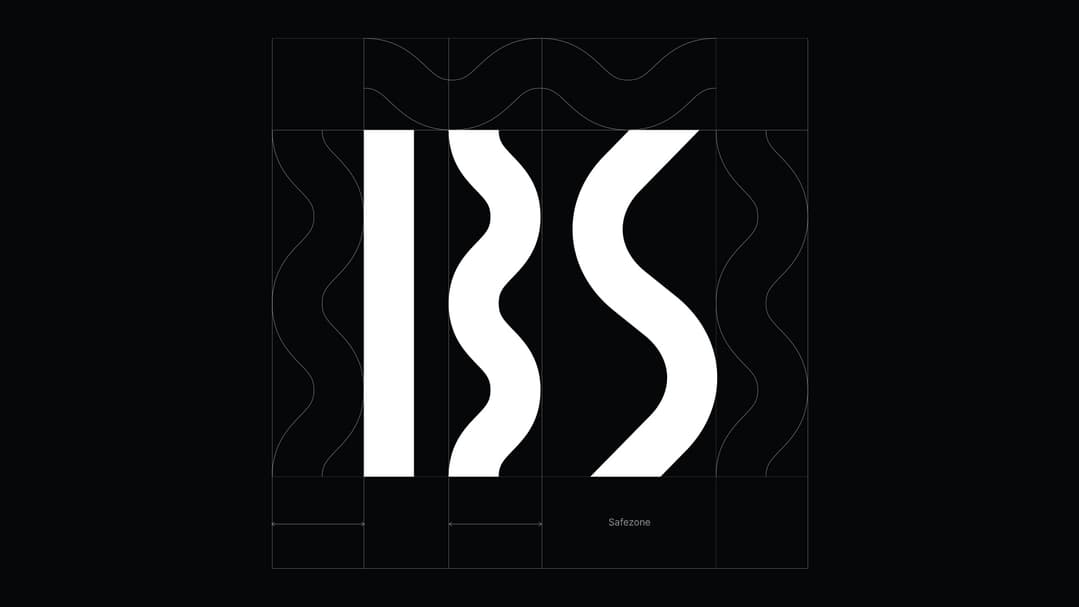
Since 2006, Bikeshop has worked hard to be able to offer Norway's largest selection of bicycles, bicycle parts and cycling clothing at good prices. In 15 years, a lot has happened, from being a small start-up company in the boys' room, to becoming Norway's largest specialist retailer for cyclists. The new design concept is based on the large selection of products. It should give association to a freedom to choose one's own path. Different paths are integrated in the logo. The roads tell us that whether you are in the city, on a country road or on a mountain trail, Bikeshop can offer you all kinds of cycling equipment. Wherever you go cycling. These roads also form the "initials" B and S which become the icon for Bikeshop.
The solution consists of simple tools, but a clear typographic animation that converts letters into different types of roads. This also gives us a pattern system that can be used on design and communication surfaces to strengthen the brand signature. The vertical movement pattern is also an important tool for creating a vibrant and dynamic visual identity.


Related projects

An enlightening visual identity
Deichman +


